UX Resarch & Responsive Site Design

UX Resarch & Responsive Site Design

UX Resarch & Responsive Site Design

Canny Cooking

A responsive web application that incorporates UX research and follows a mobile-first approach, created as a personal project. This app is dedicated to assisting users in discovering new recipes using the ingredients available in their kitchen.

Take a glimpse at the finished product.

Take a glimpse at the finished product.

Take a glimpse at the finished product.

Here are some snapshots of the finished product before we get into the details.

Here are some snapshots of the finished product before we get into the details.

Here are some snapshots of the finished product before we get into the details.

Icon Set

Icon Set

Icon Set

An assortment of food category icons featuring both active and inactive states, along with various miscellaneous icons utilized throughout the web application.

An assortment of food category icons featuring both active and inactive states, along with various miscellaneous icons utilized throughout the web application.

An assortment of food category icons featuring both active and inactive states, along with various miscellaneous icons utilized throughout the web application.

UX Research

UX Research

UX Resarch

During the research phase of this project, I embraced a Lean UX approach.

During the research phase of this project, I embraced a Lean UX approach.

During the research phase of this project, I embraced a Lean UX approach.

Competitive Analysis

Competitive Analysis

Competitive Analysis

Forks Over Knives

Forks Over Knives

Forks Over Knives


Pros: Ranked as the top food and drink recipe source on Google Play and the iOS app store. Distinguishes itself through a focus on plant-based vegan recipes.

Cons: Struggles with low SEO visibility, making it challenging to discover via web browsers without prior knowledge of the site's name. Limited accessibility, with a less user-friendly experience on iPhones compared to desktops.

Pros: The visuals are captivating, and the color scheme imparts a soothing and homely atmosphere. The brand provides numerous engaging touchpoints for users.

Cons: An overwhelming number of ads, occasionally obstructing the view of recipes. The food blog category is oversaturated with intense competition.

Competitive Analysis

Competitive Analysis

Competitive Analysis

Half Baked Harvest

Half Baked Harvest

Half Baked Harvest

User Surveys

User Surveys

Valuable and noteworthy insights gathered from users regarding their specific needs and pain points when using other recipe websites.

Valuable and noteworthy insights gathered from users regarding their specific needs and pain points when using other recipe websites.

“It’s such a waste of all the energy that went into growing the food. I feel horrible.”

“It’s such a waste of all the energy that went into growing the food. I feel horrible.”

2/3 of participants say they’ve thrown food away because they were bored with it.

All participants find the financial burden to be their biggest motivation to stop wasting food.

“Food costs money. Literally throwing money in the trash.”

“Keep it Simple. The Recipe. The Time. What is it?”

Across the board, accessibility and overly complicated recipe blogs are users' most significant pain points.

“It’s such a waste of all the energy that went into growing the food. I feel horrible.”

2/3 of participants say they’ve thrown food away because they were bored with it.

“Food costs money. Literally throwing money in the trash.”

All participants find the financial burden to be their biggest motivation to stop wasting food.

“Keep it Simple. The Recipe. The Time. What is it?”

Across the board, accessibility and overly complicated recipe blogs are users' most significant pain points.

User Personas

User Personas

Explore the UX case study's user personas, each with distinct needs and motivations. They drive my user-centered design approach, influencing decisions to create meaningful solutions.

Explore the UX case study's user personas, each with distinct needs and motivations. They drive my user-centered design approach, influencing decisions to create meaningful solutions.

Scott
28, Single, Portland, Oregon

Scott
28, Single, Portland, Oregon

Scott
28, Single, Portland, Oregon

Meet Scott, a Teaching Assistant at The University of Oregon, currently working toward a Master's degree in environmental science. Outside of his academic commitments, he actively tends to a plot in his local community garden and diligently composts any food waste generated. His primary goal is to discover fresh, sustainable recipes that allow him to utilize the vegetables he cultivates in his garden fully.

Courtney
41, Married, Austin Texas

Courtney
41, Married, Austin Texas

Courtney
41, Married, Austin Texas

Introducing Courtney, a stay-at-home mom with a Bachelor's Degree in Art History, striving to create cherished kitchen memories with her two boys. Her challenge is crafting fresh, kid-friendly meals from a limited list of ingredients, resulting in repetitive grocery shopping and wastage. She's eager to discover creative recipes to reinvigorate their cooking routine.

Ellie
19, Single, Denver, CO

Ellie
19, Single, Denver, CO

Ellie
19, Single, Denver, CO

Say hi to Ellie, a full-time waitress who's juggling her work with attending her local community college after earning her GED. She's new to independent living and is eager to discover methods for prolonging the freshness of her food. With a packed schedule due to school and work, Ellie is seeking quick and easy meal ideas that make the most of the ingredients already in her kitchen. Her ultimate goal is to adopt healthier eating habits while also saving money by reducing the waste of fresh groceries.

Ideation

Ideation

Guided by user goals, I developed vital elements for my UX/UI case study, including User Personas, MVP Objectives, User Flows, a Mood Board, and Low-fidelity wireframes. These components form the core of my user-centered design approach.

Guided by user goals, I developed vital elements for my UX/UI case study, including User Personas, MVP Objectives, User Flows, a Mood Board, and Low-fidelity wireframes. These components form the core of my user-centered design approach.

User Flow

User Flow

User Flow

The streamlined user flow caters to users' accessibility requirements. User testing participants unanimously emphasized the desire for a straightforward recipe web app without the unnecessary complexities found in existing options.

The streamlined user flow caters to users' accessibility requirements. User testing participants unanimously emphasized the desire for a straightforward recipe web app without the unnecessary complexities found in existing options.

The streamlined user flow caters to users' accessibility requirements. User testing participants unanimously emphasized the desire for a straightforward recipe web app without the unnecessary complexities found in existing options.

Mood Board

Mood Board

I opted for a fresh and open mood in this project, aiming to evoke the sense of enjoying a picnic in the park with loved ones. Recognizing the potential apprehension when learning to prepare new dishes, I designed this project to offer users a welcoming and relaxing experience from the outset.

I opted for a fresh and open mood in this project, aiming to evoke the sense of enjoying a picnic in the park with loved ones. Recognizing the potential apprehension when learning to prepare new dishes, I designed this project to offer users a welcoming and relaxing experience from the outset.

I opted for a fresh and open mood in this project, aiming to evoke the sense of enjoying a picnic in the park with loved ones. Recognizing the potential apprehension when learning to prepare new dishes, I designed this project to offer users a welcoming and relaxing experience from the outset.

Low Fidelity Wireframes

Low Fidelity Wireframes

Low Fidelity Wireframes

I first used the Crazy 8’s method on paper to design low-fidelity wireframes. This allows me to make many iterations of my ideas early on and not put myself in a box by sticking to my first iteration of any screen. After this process, I chose the best version of each screen and turned them into low-fidelity wireframes on Balsamiq.

I first used the Crazy 8’s method on paper to design low-fidelity wireframes. This allows me to make many iterations of my ideas early on and not put myself in a box by sticking to my first iteration of any screen. After this process, I chose the best version of each screen and turned them into low-fidelity wireframes on Balsamiq.

I first used the Crazy 8’s method on paper to design low-fidelity wireframes. This allows me to make many iterations of my ideas early on and not put myself in a box by sticking to my first iteration of any screen. After this process, I chose the best version of each screen and turned them into low-fidelity wireframes on Balsamiq.

Mid Fidelity Wireframes

Mid Fidelity Wireframes

Mid Fidelity Wireframes

Transforming the low-fidelity wireframes into mid-fidelity wireframes in Figma, following a layout grid, provides more structure to the design before adding copy, images, and color.

Transforming the low-fidelity wireframes into mid-fidelity wireframes in Figma, following a layout grid, provides more structure to the design before adding copy, images, and color.

Transforming the low-fidelity wireframes into mid-fidelity wireframes in Figma, following a layout grid, provides more structure to the design before adding copy, images, and color.

User Testing Feedback

User Testing Feedback

I incorporated this feedback during the last iteration of the high-fidelity wireframes. Positive feedback is represented on green cards, while constructive feedback is indicated on red cards.

I incorporated this feedback during the last iteration of the high-fidelity wireframes. Positive feedback is represented on green cards, while constructive feedback is indicated on red cards.

Love the color palette, which provides calming vibes.

Spacing and alignments work well.

Elements should align with the edges of images.

Nice and clean.

Pops of color on the white background accent elements nicely.

Too many search bars.

Unsure what the filter buttons stand for.

Great Typography.

Margins are too small on larger screens.

Recipe images need “more room to breathe”.
Style Guide

Style Guide


Imagery

Imagery

Imagery

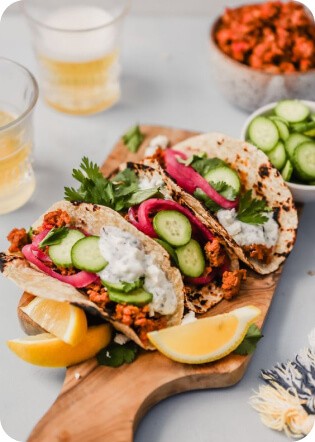
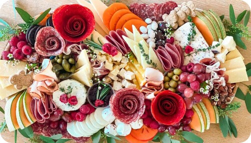
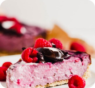
The imagery, characterized by white backgrounds and vibrant, appetizing foods, aligns with the brand's identity.

The imagery, characterized by white backgrounds and vibrant, appetizing foods, aligns with the brand's identity.

Icon Set


Icon Set

An assortment of food category icons featuring both active and inactive states, along with various miscellaneous icons utilized throughout the web application.

An assortment of food category icons featuring both active and inactive states, along with various miscellaneous icons utilized throughout the web application.

Color Palette

The color palette, with its soft pastel hues, evokes an airy picnic vibe, creating a welcoming and relaxed atmosphere that enhances the user experience.

The color palette, with its soft pastel hues, evokes an airy picnic vibe, creating a welcoming and relaxed atmosphere that enhances the user experience.


Typograhpy

Typograhpy

The selected typography not only aligns with the project's overall design but also contributes to a seamless and engaging interaction for users.

The selected typography not only aligns with the project's overall design but also contributes to a seamless and engaging interaction for users.

High Fidelity Wireframes

High Fidelity Wireframes

High Fidelity Wireframes

Thanks for reading.

Thanks for reading.

Feel free to check out more of my work.

Feel free to check out more of my work.